KidLit Connection: Getting to Know Children’s Illustrator, Shiho Pate
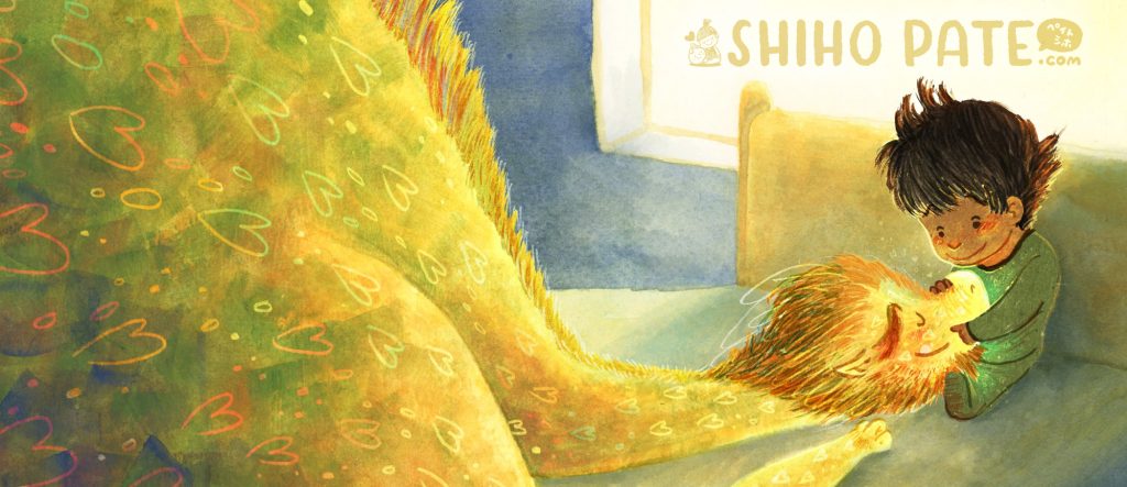
I’m so pleased to share this month’s KidLit Connection interview with children’s book illustrator, Shiho Pate! Shiho’s art has a playful and bold style that makes use of both traditional and digital mediums to convey a sense of warmth and fun. She is an illustrator who was born in Japan and now lives in Southern California. Shiho got her start in the gaming industry in New York City. While she has much gratitude for her years working as a game artist, she is so happy to be creating books for kids now.

Please join me in congratulating Shiho on not one but TWO book birthdays this month! Just this past week, THE RESCUES: BEST DAY EVER, written by Tommy Greenwald and Charlie Greenwald (Red Comet Press), was released! This is the second in the early reader book series THE RESCUES, both of which Shiho has illustrated. And earlier this month, BABY STEPS, an adorable picture book written by Kimberly Derting (Abrams Appleseed) also came out. We’ll talk more about these books in the interview, plus more about how Shiho got her start in illustration, what inspires her, and more about her illustration process. Welcome, Shiho!


An Interview with Children’s Book Illustrator, Shiho Pate

We’d love to hear more about you and your art! Can you tell us more about your work as an illustrator for kids?
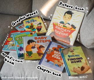
Absolutely. And thank you for the opportunity! Hi I’m Shiho Pate. I love making all kinds of children’s books such as picture books, chapter books, graphic novels and science books! I tend to gravitate towards books that have great energy and lots of emotion. Yes, even science books have lots of emotion! When I’m done drawing my face tends to hurt because I (unknowingly) make the facial expressions that the characters make. I connect to the stories and characters by exploring beyond the words. If it’s not in the story, I think about settings, character personalities and histories, mood and so on. I also talk with my editor (who relays it to the author) about these things to make sure I’m aligned with their vision. My favorite part of the book making process is making the book as a team. 

How did you get your start as a children’s book illustrator and what lead you down this path?

I change (improve?) this answer all the time because I’m not sure when I actually started. The technical answer is when I talked to my agent. My illustrator mentor introduced me to my lovely agent Deborah Warren at East West Literary Agency. It felt real when I started talking to Deborah. But, I think my earliest influence was watching my mom make children’s books when I was a kid. She took several children’s book making classes from our local library in Japan. She did it because it was fun. That stuck with me. That’s when I realized I could make my own stories and draw them too! MAGIC.

The path to working professionally took a while though. I went to art college and took children’s book classes. I thought I was going to be a children’s book illustrator right after graduating, but because I needed a working visa, I became a full time game artist for an indie game studio. This was the best decision I could have made. I learned a lot about digital art, character design, graphic design, time management, working as a team and communicating effectively. While working I also started making book dummies, visited museums and attended conferences. My game studio art director also critiqued my book dummies. All of that helped me a lot when I met Deborah.
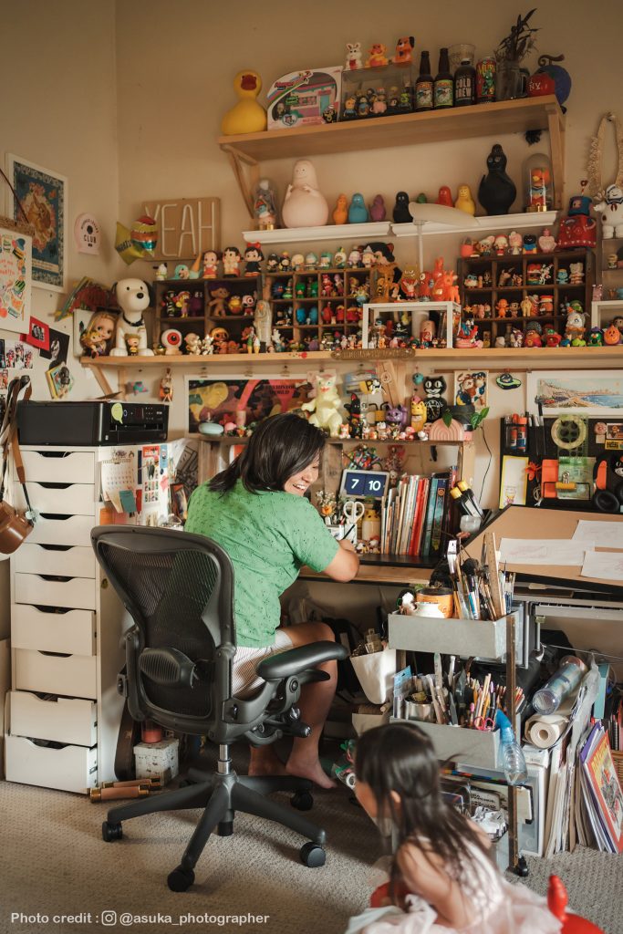
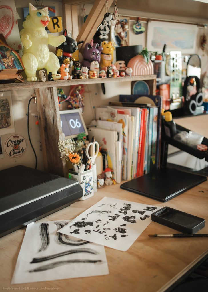
Can you tell us more about how you work? What sort of tools and process do you use to create your illustrations?

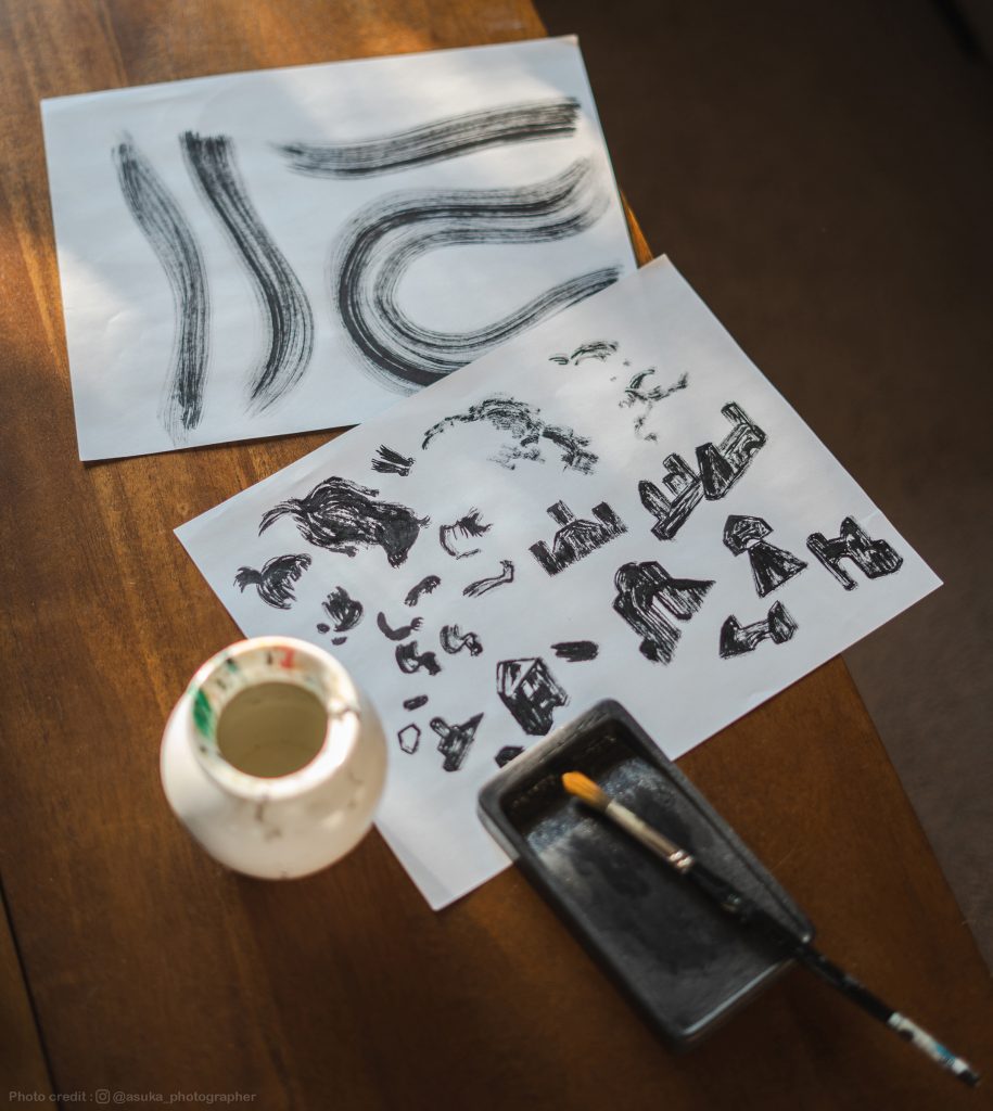
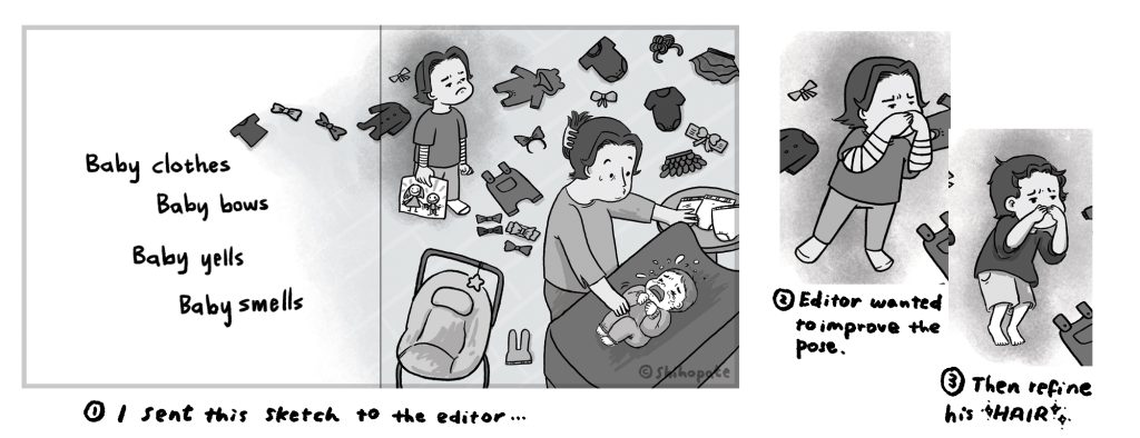
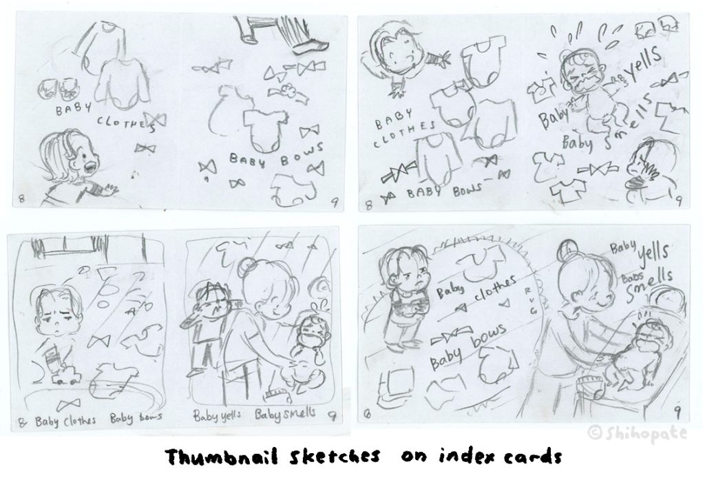
I work in a studio filled with toys and loud music haha. I do have a spotify playlist if you’re interested in what I listen to while I work. Music is my favorite tool to get me excited to draw. My lines flow better. Oh and coffee helps. I use index cards to do thumbnail sketches. I feel like a detective because I lay out all of the spreads to the cork board. It helps when I see the flow of the book. Because the sketches are so small and quick, I try out different ideas. Then do the full sized sketches digitally. It’s the fastest for me especially when I get edits from my editor.

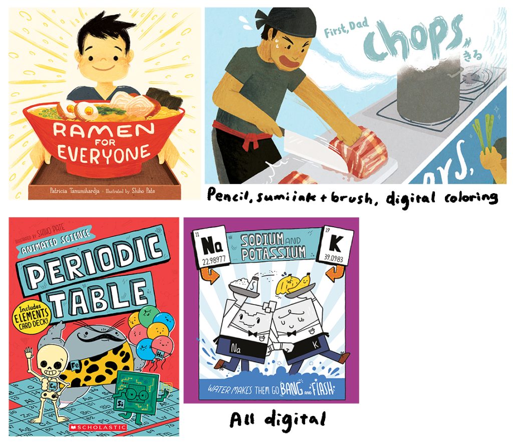
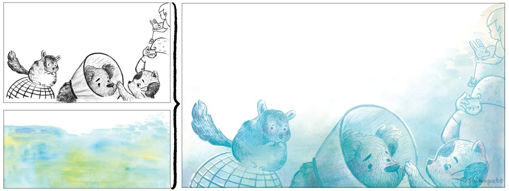
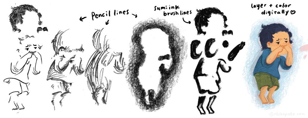
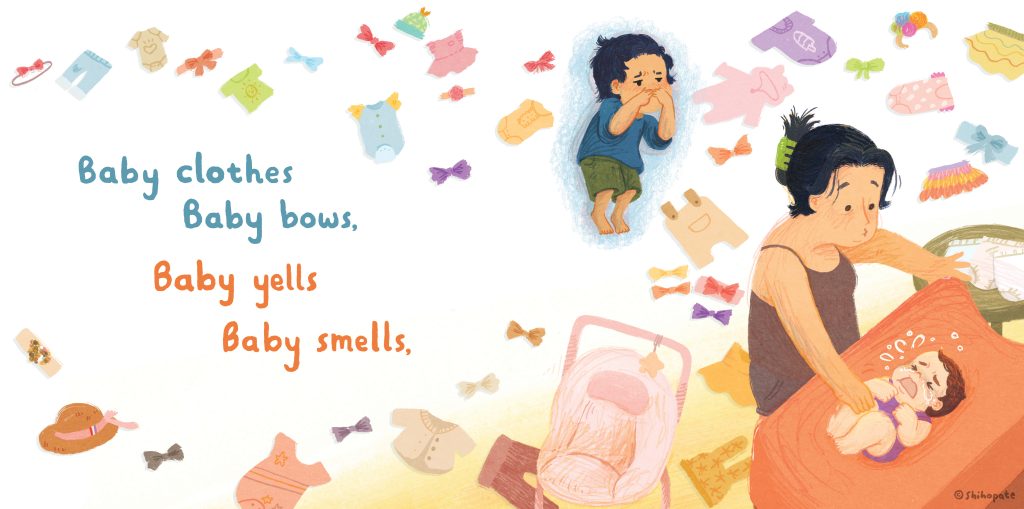
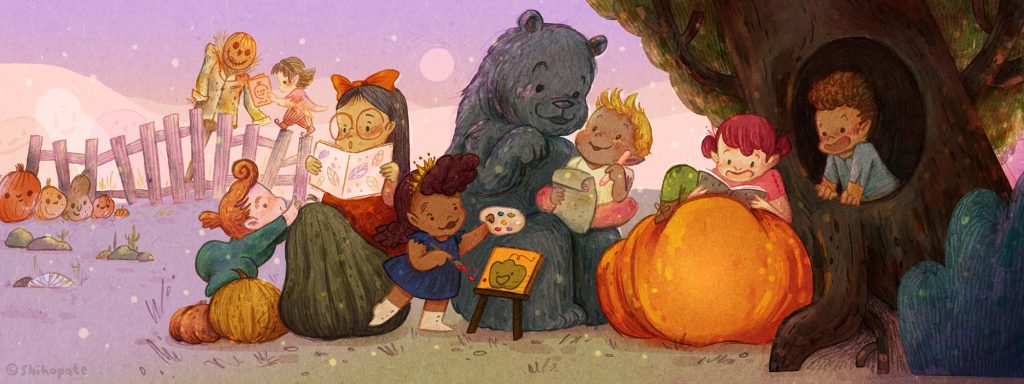
As for the actual art tools I use to create illustrations, I have two treatments. One is texture heavy treatment. I usually choose this treatment for picture books and chapter books. I use pencil, sumi ink and digitally color them. Sometimes I use watercolor. Sometimes I scan in textures. The second treatment has outlines and a simple color fill. I usually choose this treatment for graphic novels and science books. I love both treatments equally 🙂 
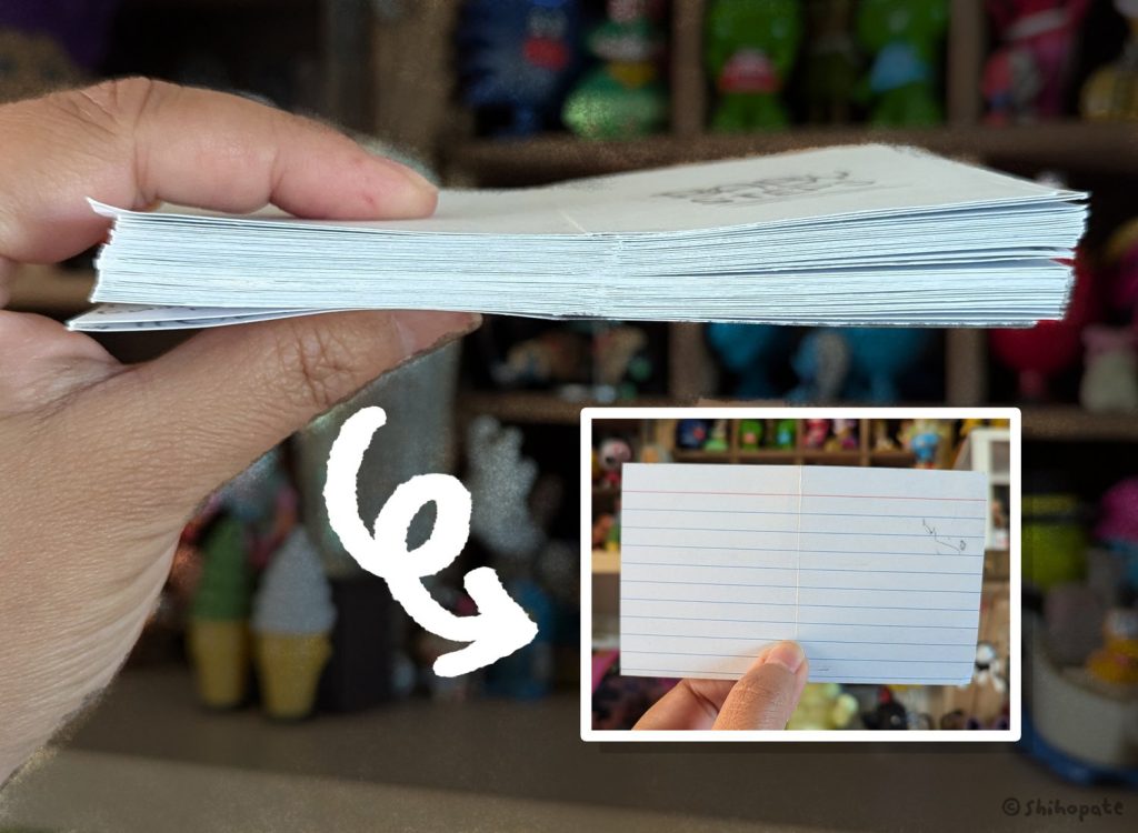
From Index Card Thumbnails to Final Art Styles

Your most recent book, THE RESCUES BEST DAY EVER, written by Tommy Greenwald and Charlie Greenwald (Red Comet Press) just released this week! Congrats! This is the second in a series about animals who were previously unwanted, found a loving new home, and have become good friends. Can you tell us more about this book?
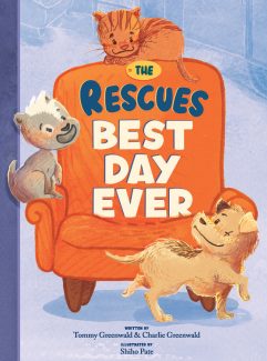
Thank you for asking! I love talking about THE RESCUES series because it’s an invitation for readers to tell me their rescue animal stories! I’ve been having so much fun illustrating Tommy and Charlie’s stories because it’s filled with energy, humor and love. The first book THE RESCUES FINDING HOME is about two rescue dogs Moose and Bear finding their forever home. But, there’s actually a third character. Tiger the cat joins at the end of the book (sorry for the spoiler!).

In the second book THE RESCUES BEST DAY EVER you get to peek into their bright daily lives. They get to go on a trip (to the vet?!) argue about their space (MY favorite couch!) and tackle monsters (stormy weather) together. It’s really fun to read out loud. THE RESCUES is an easy-to-read chapter book so it’s perfect for reluctant readers or kids that are transitioning from picture books. Or, read to your pets!

When working on THE RESCUES series, what was one of your favorite parts of the project? And what was something you found challenging?

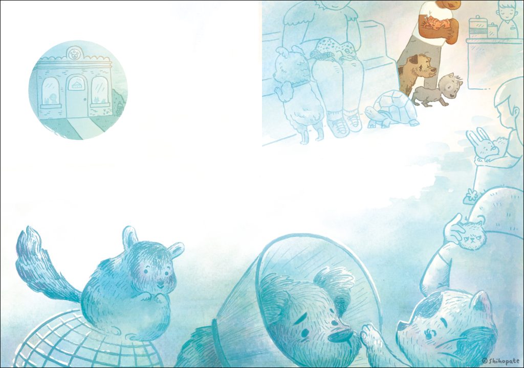
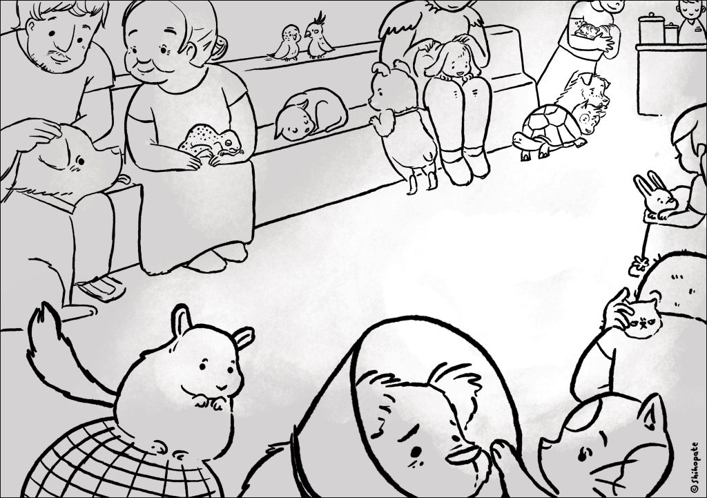
My favorite part was collaborating with my art director Mike. He welcomed anything and everything! He pushed me to draw beyond the obvious and literal representation of the story. I always have the best time on video calls with Mike because we talk and understand each other’s visions. For example, I did a sketch of the vet waiting room. I got so excited about drawing all kinds of animals and their owners. I think I even started thinking about why they had to visit the vet. I thought squeezing Moose and Bear at the back of the room helped to visualize the pressure of going into the vet. When Mike saw the sketch, he gently nudged me and suggested it was more about Moose and Bear’s emotion. How they were worried and scared to go into the vet. But doing their best to stay because they trust Tiger and Cathy. That switch helped me focus.
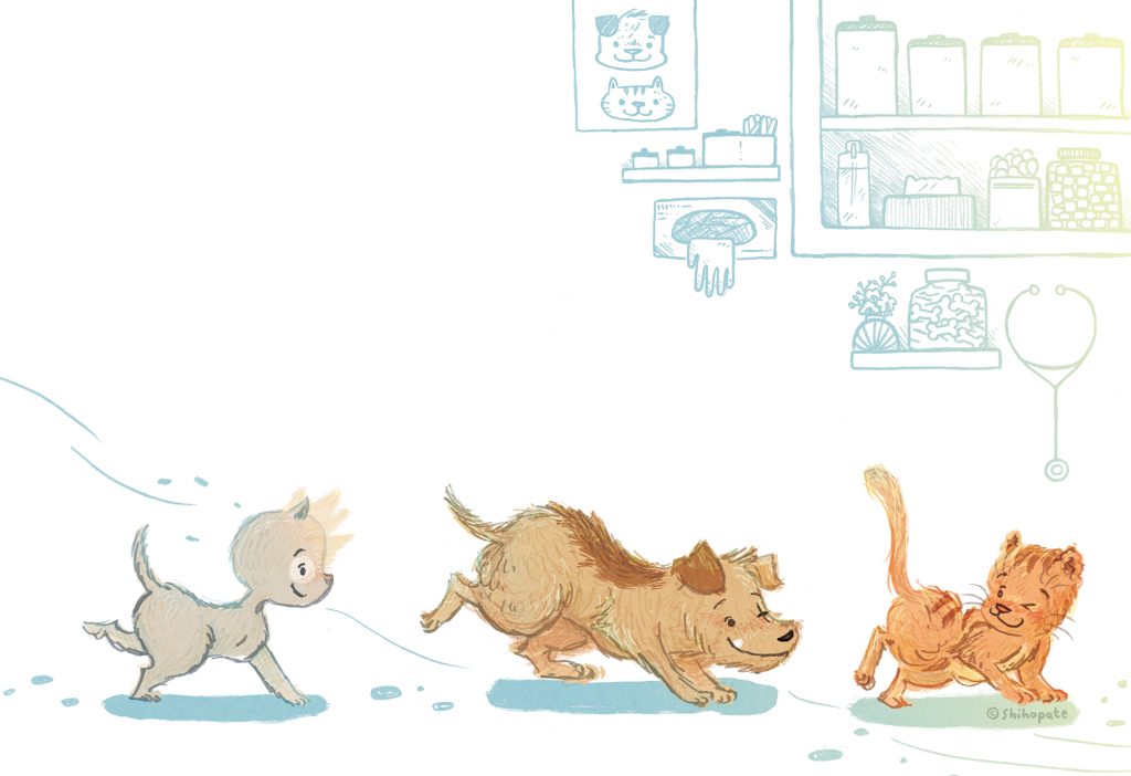
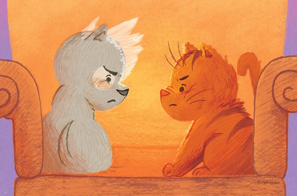
The challenges… hmm. Not really a challenge but Mike and I did figure out a specific color palette per chapter. Because THE RESCUES BEST DAY EVER starts at the beginning of the day, we went with light blue and greens for chapter one. Then in chapter two we went with warm yellows and oranges to represent the later afternoon cozy feel. For chapter three we chose dark blues, purples and bright pinks because the storm comes and the story gets so hyper. It was so fun! 
You have another book, BABY STEPS written by Kimberly Derting (Abrams Appleseed) that just came out earlier this month. We’d love to hear more about this book too.
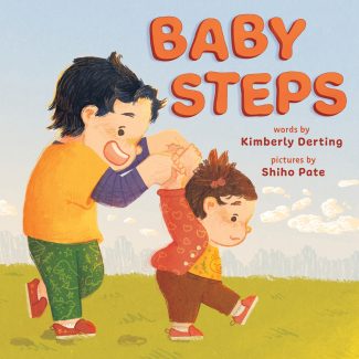
Yes! Kimberly’s story is so simple and beautiful! It was my first time illustrating a book where the character grows so much, literally. The story begins where the little sister comes home from the hospital, and the book is about how the boy becomes a big brother to the sister. So I had to draw the little sister from the baby phase to the toddler phase. It was challenging and so rewarding. I looked at a lot of my daughter’s photos, my sister’s daughter and sketched my friend’s kids. I’m the oldest sister in my family so I know what the big brother goes through. It’s not always ME FIRST or ME ONLY anymore, and it’s not always fun. BABY STEPS validates those feelings. When I read Kimberly’s story I felt like I got a warm hug. I hope the book invites conversations. 
Do you have anything else new you’re working on that you can tell us about?

Ooo, I can’t talk about my upcoming books yet but it’s happening! I’m so grateful! I’m also on submission with my first author-illustrator book.

What is one of your biggest wishes for your work as an illustrator of children’s books?

My biggest wish for my books is that kids will read the book over and over until the pages become wrinkly. And that those kids will read my books to their kids when they grow up. 
What is something you would tell aspiring children’s book illustrators hoping to break into the field?

This is always a hard question, and my answer changes a lot, sorry. Draw things you’re passionate about. And, finish a book dummy. You will learn the most by making a book. You got this. 
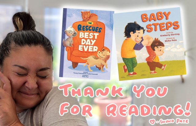
A picture of Shiho smiling with her two newest books. The text reads, "Thank you for reading!"

See More from Shiho Pate!

To learn more about Shiho Pate and see more of her art, visit her online at these links:

Shiho is represented for children’s books by Deborah Warren at East West Literary Agency.


Are you a published or soon-to-be published illustrator or author/illustrator who loves creating books about nature, animals, the environment, social justice, or mindfulness? I’d love to chat with you for a KidLit Connection interview! Send me a message.


KidLit Connection: Getting to Know Author-Illustrator, Angela Quezada Padron

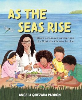
Welcome to the latest KidLit Connection interview! I’m so pleased to introduce Angela Quezada Padron, an author and illustrator of children’s books, including picture books, board books, and novels. Her debut author-illustrated picture book, AS THE SEAS RISE: Nicole Hernández Hammer and the Fight for Climate Justice (Atheneum Books for Young Readers) just released this June! She’ll share more about this book in the interview.

Angela writes and illustrates both fiction and nonfiction stories. Her nonfiction work celebrates people in the Latino community who have made a difference in the world and within their community. Angela has worked as a freelance writer, illustrator, fine artist, and curriculum designer for educational publishers. She is a lover of nature, music, and sports. When she’s not writing, drawing, and painting, you can find Angela creating music, collecting seashells, and enjoying the natural world.


An Interview with Children’s Book Author and Illustrator, Angela Quezada Padron

First, we’d love to hear more about you as an illustrator and author. Can you tell us more about you and your work as a creator of books for kids?

Thank you so much for this opportunity to interview with you and share about myself. I write and illustrate fiction and nonfiction children’s books, mainly picture books but also board books and novels. In 2007, I started an illustration master’s program through the Academy of Art University in San Francisco, and I graduated with my MFA in 2011. In 2012, I illustrated a few books for McGraw Hill, an educational publisher. Then in 2014 I was hired for two books—THE HERO IN YOU by Ellis Paul (Albert Whitman & Co.) and MY BODY BELONGS TO ME by Jill Starishevsky (Free Spirit Publishing). I was also a semi-finalist in the Tomie de Paola contest through SCBWI in 2014, and I was offered the chance to illustrate a story called FIREFIGHTER MOM in Cricket Magazine in 2016. I felt like I was on a roll! Then things died down and I didn’t have any luck until 2021 when Atheneum Books picked up my first author/illustrator book, AS THE SEAS RISE. Since then, I’ve had some other illustration projects with educational publishers, and sold three other books due out between 2025-2027.

How did you start creating children’s books? Was there anything in particular that inspired you to pursue it?

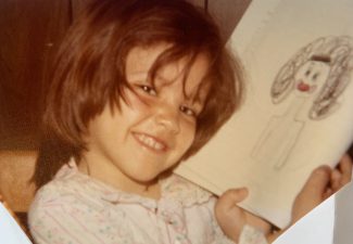
I’ve actually been creating books since I was little. My mom saved many of my “books” that I wrote and illustrated as early as four-years-old. Most of the books were about her when she was pregnant with my younger brother, me meeting Santa Claus, or Snoopy. I also saved my stories from my seventh-grade creative writing class. I didn’t realize, though, that this could be a legitimate path for me until I began teaching in my mid-20’s. Working in schools exposes you to more children’s books. As I read more books, I became more interested in studying about the authors and illustrators and how they got their books published. Some time in my early 30’s, I came up with a story idea but wasn’t sure how to format it or where to even get eyes on it to try and publish it. 

I joined the Society of Children’s Book Writers and Illustrators (SCBWI) in 2004, and I’ve been on this path ever since. I joined a critique group, of which I am still a part of (shoutout to the Aventura Critique Group in Florida)! My writing friends and critique partners have helped me so much with telling me what works and what doesn’t in each of my stories. They’ve shown me how to strengthen my work and tighten my word choices. Without them, there is no doubt I would never have been published. 

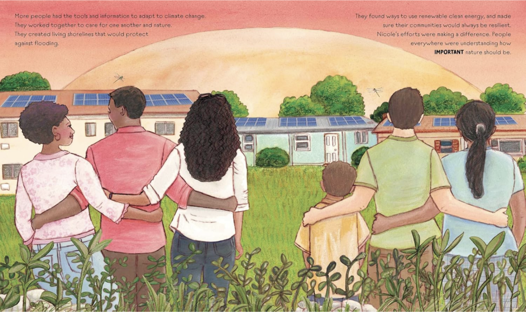
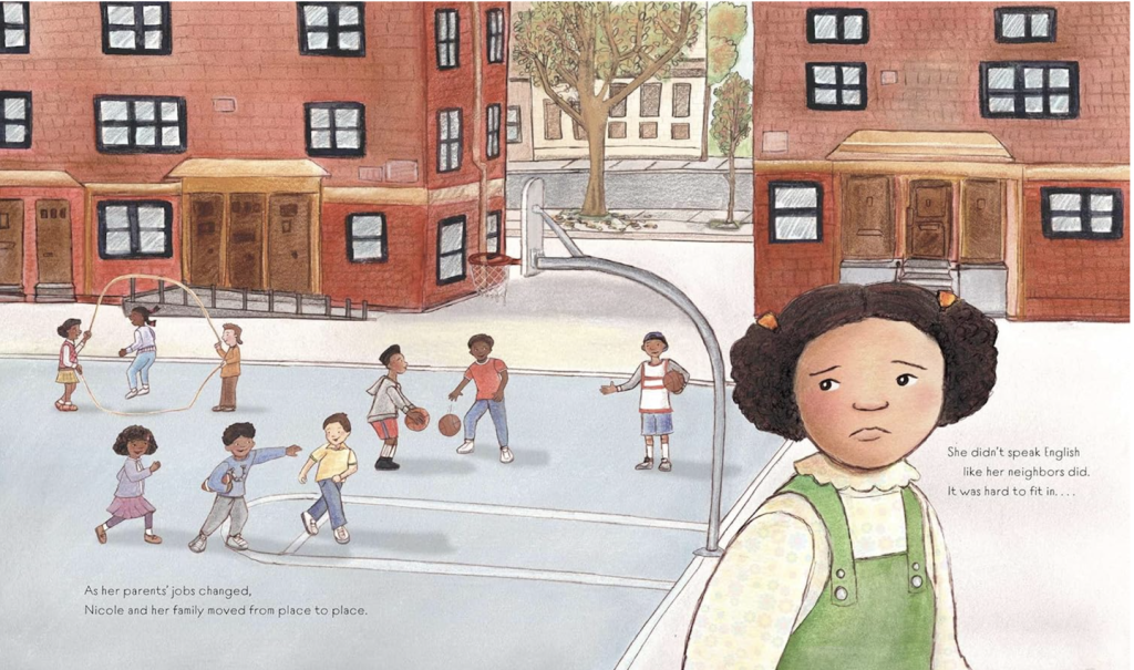
Your most recent book, AS THE SEAS RISE: NICOLE HERNÁNDEZ HAMMER AND THE FIGHT FOR CLIMATE JUSTICE (Atheneum Books for Young Readers) just came out in June—congrats! This is a powerful, lyrical biography about a Latina environmental scientist and climate activist who has worked for climate justice in vulnerable communities.  Can you tell us more about this story and what inspired you to write and illustrate it?

Thank you so much! It truly was an honor to create this book about Nicole. After attending a 2020 SCBWI online conference about nonfiction children’s books, I became interested in writing a children’s book biography about a Latina figure who was involved in science in some way. After doing some searching online, I came across an article about Nicole Hernández Hammer where it stated that she was invited by First Lady Michelle Obama to attend the State of the Union address in 2015. Nicole was recognized due to her work advocating for climate justice in communities of color and educating others about how climate change was affecting the health of people in Latino communities. That inspired me to learn even more about her, as well as about sea level rise and climate justice. I wouldn’t call myself an advocate for climate change or justice, however I am conscious about how I’m contributing to climate change and climate justice and always looking for ways to support, adjust my ways and beliefs if needed, and learning what actions I can take to make this world better. 

When I was writing the book, I found her on LinkedIn and took a chance to message her and said: ‘Hi, I have this story. I would love to interview you.’ And she said, ‘Sure.’ So we set up a time on Zoom and we chatted. I wanted to verify things that I had read. She gave me other insight, too, that had not been in any articles. I told her I would share this story with her once I had finished writing it, which I did. Within two or three months I got an offer from Atheneum (Books for Young Readers). I kept Nicole in the loop the entire time. I paid her a consultation fee, to consult throughout the book. We stayed in contact throughout the entire creation of the book, which obviously lends more credibility to the book.

When working on AS THE SEAS RISE, what was one of your favorite parts of the project?

I really enjoyed my conversations with Nicole and learning about her life. Throughout the process, she sent me photos of her and her family to use as references for the illustrations. She also taught me a lot of the correct terminology to use when speaking about climate justice (for example, we shouldn’t say we want to “help” frontline communities but rather “partner with” frontline communities so they can get the services and support they need to stay resilient against climate change). 

What was one of your biggest challenges when working on AS THE SEAS RISE?

A nonfiction 48-page biography is probably one of the hardest books to make, especially as my author/illustrator debut. Most books are 32 pages, with fictional stories you can make up the characters and places, and you have more freedom to stylize the characters and backgrounds. With biographies, you have to be as accurate as possible with the facts and the depiction of the person. And, when the person is still alive and you’re communicating with them, you want to be EXTRA exact to do them proud. I had the pressure on myself to try to make it as perfect and accurate as possible.

In addition, my father was ailing and passed away in 2021, right in the middle of me working on the final text. Then I was dealing with some health issues in the spring of 2022 that affected me finishing the art. But I pushed through it and got it done!

We’d love to hear more about how you work! What sort of process and tools do you use to create both your illustrations and writing?

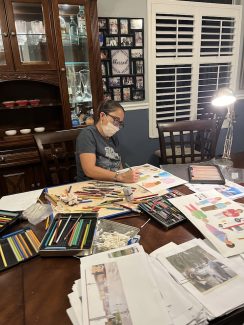
In the past, including for AS THE SEAS RISE, I would do most of the illustrations by hand using pencil. First, I do a lot of research and find photos that will inspire some or all parts of a drawing. Sometimes it’s the right background or object I needed, and sometimes it’s just a pose I needed. I often look at videos and then take screenshots while videos are playing because that allows you to capture a person in action rather than a posed shot. For the cover of SEAS, I saw a Twitter post about kids making models of their communities protected for climate change. Nicole and I thought that would be a good theme for the cover, and the editor agreed!

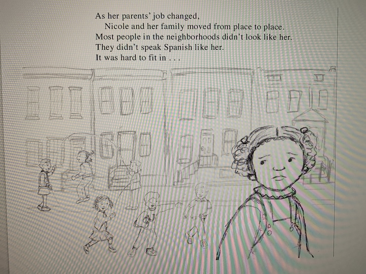
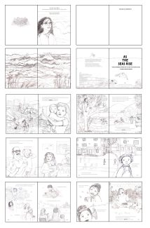
After I had my ideas, I would draw thumbnail sketches to get a sense of layout and how to paginate the text. Then I did more refined thumbnails. Once I had the layouts decided, each part of an illustration was drawn by hand on vellum using Prismacolor Col-erase pencils. I find vellum to be a beautifully smooth surface that doesn’t smear, and the col-erase pencils have a nice texture as well as don’t smear like regular pencils. I would scan them into my computer, clean them up and adjust as needed. Once the editor saw the sketches and gave feedback, I made necessary adjustments and then drew the final outlines.

Then I would print all of the parts – people, objects, backgrounds – onto several pieces of BFK Rives paper which is mainly used for printmaking. It’s thick, doesn’t really warp and can hold a lot of layers of paint and coloring. Plus it has a nice texture to it. I would tape the paper down onto wooden boards and then color in the drawings with gouache, watercolor, pastel and/or colored pencil. After that, I would scan all the painted papers back into Photoshop, put each part on its own layer (meaning, the people and objects would be placed on individual layers in Photoshop) and then add in my original sketches as overlays to make sure the lines were clean. I would then finish in Photoshop to clean up, resize, and change color of any part if need be. 

However, after doing a 48-page picture book like SEAS in this style, I realized that I need to work digitally more to save time and to save my aging hands from tiring out! So, now I tend to draw parts by hand still on vellum, scan them in and then redraw over them in Photoshop or Procreate. I do a combination of coloring digitally and scanning in painting or textured paper to fill in the illustrations like digital collage. Some of my work on my website was created with digital collage in this manner, and some were done by drawing and coloring by hand, then scanning in and putting them together digitally.

You have three other books you’re currently working on which will be out in the future. Can you tell us more about them?

I would love to! FROM THE FIELDS TO THE FIGHT: HOW JESSICA GOVEA THORBOURNE ORGANIZED FOR JUSTICE comes out with Atheneum Books in 2026. Jessica worked with Cesar Chavez during the grape boycott to fight for equal rights for farm workers and labor unions. That is being illustrated by the talented Sol Salinas. The next book, AN ISLAND CALLED HOME (Eerdman’s Books, 2026) is a fictional story about a girl who visits her father’s home country for the first time and learns about her extended family and her bilingual and bicultural heritage. It’s based on my life with my father who is from the Dominican Republic, and I will be illustrating that one. Lastly, LUCIA’S GOALS (Lee & Low), which is being illustrated by Christina Barragan-Forshay, is about a girl who wants to play soccer but battles through sexism, racism, and inequality to make her dream come true. The publication date is not finalized yet but should be out in the next couple of years. 

Some people might wonder why an illustrator wouldn’t illustrate all their books. The truth is my style doesn’t always fit with the stories I write, and I don’t want to be limited to only pursuing books that I could best illustrate. 

What is your greatest wish for your work as an illustrator and author?

What a great question. I focus on the stories that have an emotional tie-in that will allow readers to connect to the story in some way. I think about how a particular story will inspire and impact kids and encourage them to read more. For example, I hope books like SEAS and FIELDS inspire kids to take action against injustice, while LUCIA can show what perseverance is, and ISLAND can show readers another culture or family situation they may never have known about. Some of my other stories I hope to publish will just make kids laugh or entertain them and others may warm their hearts. In the end, I create the stories because I love to and want to share my ideas and creations with the world. But to me, it’s most important that the kids enjoy reading them and connect with the stories. Otherwise, there’s no point in doing them at all. 

Is there something you would like to tell aspiring children’s book illustrators and authors who hope to be published someday?

Definitely look into organizations like SCBWI to learn about the industry and connect with others. Do your research before submitting to agents and editors to make sure your style and goals match with theirs. Write and illustrate what you love, not what the trends say you should do. Illustrate in the style and medium YOU want to, not in the style others tell you you should. BUT, always be open to feedback and suggestions. Find other creators to connect with so you get that honest feedback and encouragement. Most importantly, never give up. It can take years to get your first book deal or project and when you do, all the hard work will have been worth it!

I also want to acknowledge Giuseppe Castellano from The Illustration Department. A few years ago, I was feeling like my work wasn’t good enough and doubting myself. I signed up for a portfolio review and mentorship with Giuseppe, whose advice and encouragement were essential to help me rebuild my portfolio and come up with ideas for the compositions for AS THE SEAS RISE. Publishing really is a collaborative effort!

Learn More About Angela Quezada Padron

To learn more about Angela Quezada Padron and to see more of her work, follow her on social media and visit these links:

Angela is represented by Sera Rivers at Speilburg Literary.


Are you a published or soon-to-be published illustrator or author/illustrator who loves creating books about nature, animals, the environment, social justice, or mindfulness? I’d love to chat with you for a KidLit Connection interview! Send me a message.

KidLit Connection: Getting to Know Illustrator, Acamy Schleikorn

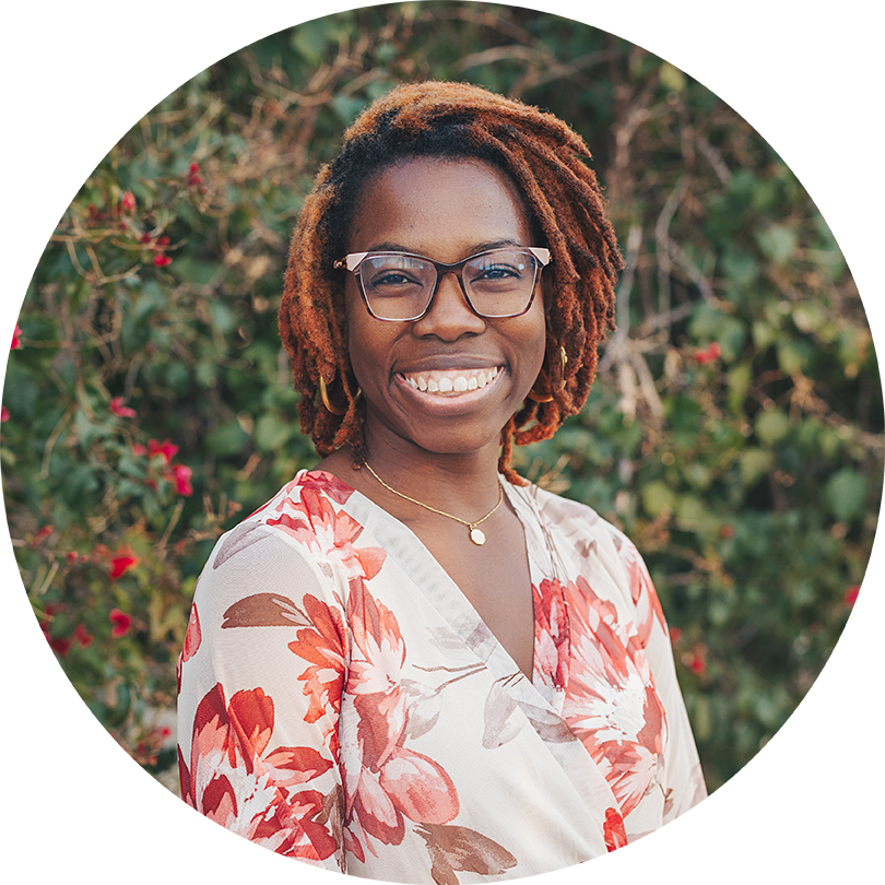
Illustrator and author, Acamy Schleikorn smiles in an outdoor garden backdrop. Academy is a Black woman with glasses, hair in locs, and in this photo wears a floral blouse.

The latest KidLit Connection interview is here! And I’m so excited to celebrate a very happy book birthday with illustrator, Acamy Schleikorn! This past week, Acamy celebrated the release of her debut book, NOT MY CAT, written by Stacy Patton, published by Simon & Schuster for Young Readers. Acamy is an illustrator and writer from Las Vegas who creates stories and art that celebrate diversity and joy in the Black community. Her illustrations have a focus on family, friendship, joy, and imagination with a unique and playful style, using digital tools with a textural, traditional feel.

In this interview, Acamy shares more about her process, what inspires her, and more about her new book and upcoming projects. I’ve had the pleasure of working with Acamy as a critique partner in the past and it’s been a joy to see her grow and bloom in her picture book career. I can’t wait for you to learn more and read her new book!


An Interview with Children’s Book Illustrator and Author, Acamy Schleikorn

Can you tell us more about yourself? What do you love about illustrating books and what inspires you and your art?

For those that don’t know, my name is pronounced uh-kay-me and I absolutely love my name! I’m a wife and mom. When I’m not illustrating, I’m spending time with my family, practicing piano, or baking anything sourdough. My favorite thing about illustrating picture books is that I get to include snippets of my own world into my art. I love expressing myself in that way. The very things that make me who I am can be seen sprinkled throughout a lot of my art. For example, I love laughing, so you’ll see a lot of joy and heartwarming scenes depicted in my art. I think it’s awesome because we can never have too much joy in our lives, right?! It’s truly my favorite thing to illustrate. Honestly, all kinds of things inspire me like nature, my family and other art. I like reminding myself that there is inspiration all around me if I take the time to notice it. 

How did you get your start illustrating picture books? We’d love to know more about the path you took to get here.

Before I was an illustrator, I was a hand lettering artist that focused on weddings. I’d hand letter wedding welcome signs, seating charts, table cards, and all kinds of other things. It was cool, but it became repetitive for me, and I just wasn’t fulfilled. Once I discovered the world of picture books, it was a wrap. I was hooked and in love. I have a heart for children, so this was a perfect way for me to do something that would impact them in a positive way. I posted a lot of my artwork on social media when I was just starting out. My agent actually found me using the #PortfolioDay hashtag on Twitter. It was truly a blessing, because I didn’t even realize I had that kind of potential at the time. My agent is awesome, because she is able to draw out the gold in me that I didn’t know was there. When my agent emailed me about an inquiry she received for me to illustrate NOT MY CAT for the first time, I was shocked! The amazing journey I was on became so much more real!

Your debut picture book, NOT MY CAT (written by Stacey Patton and published by Simon & Schuster), is a funny story about Staceypants who says she doesn’t want a cat, but somehow finds herself with a cat who chooses to adopt her. Can you tell us more about this book?

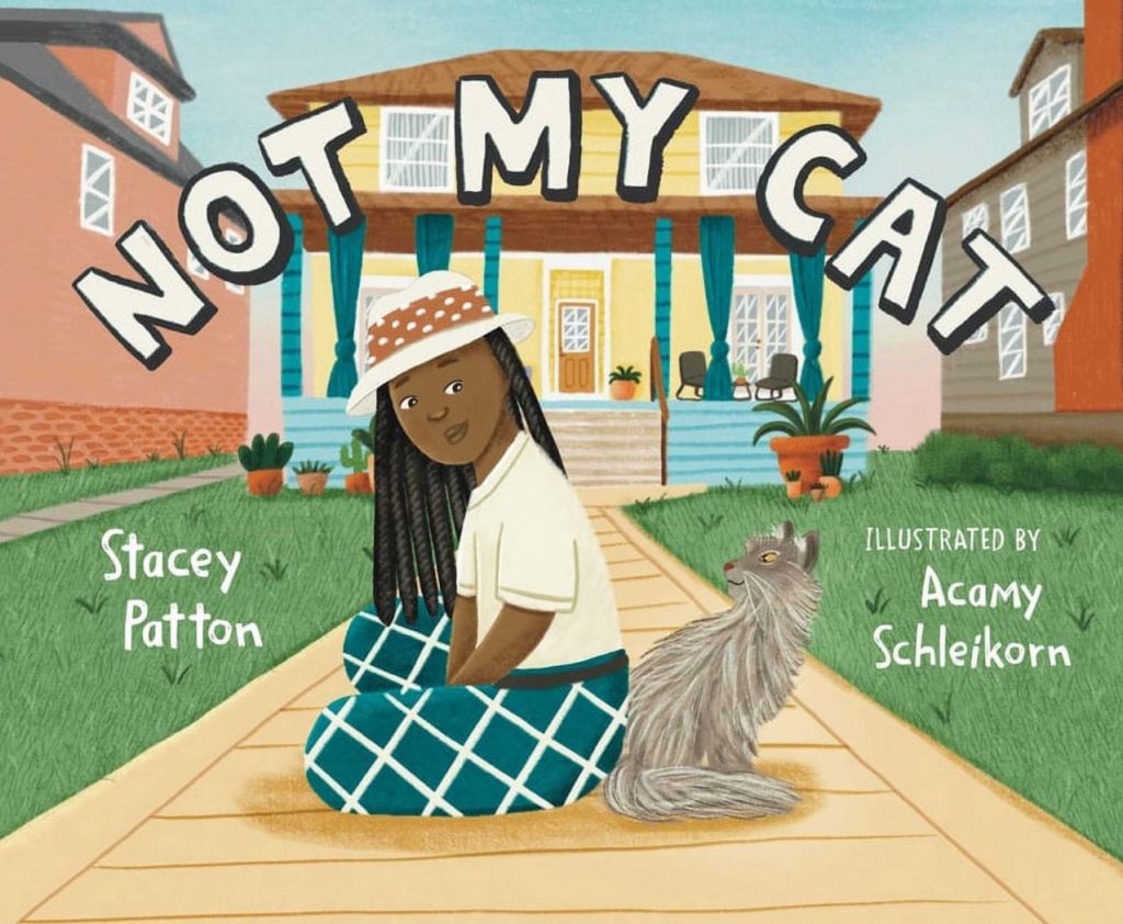
The book cover for NOT MY CAT by Stacy Patton and illustrated by Aacamy Schleikorn. A Black woman with locs sits on a sidewalk with a grey cat leading up to a yellow house.

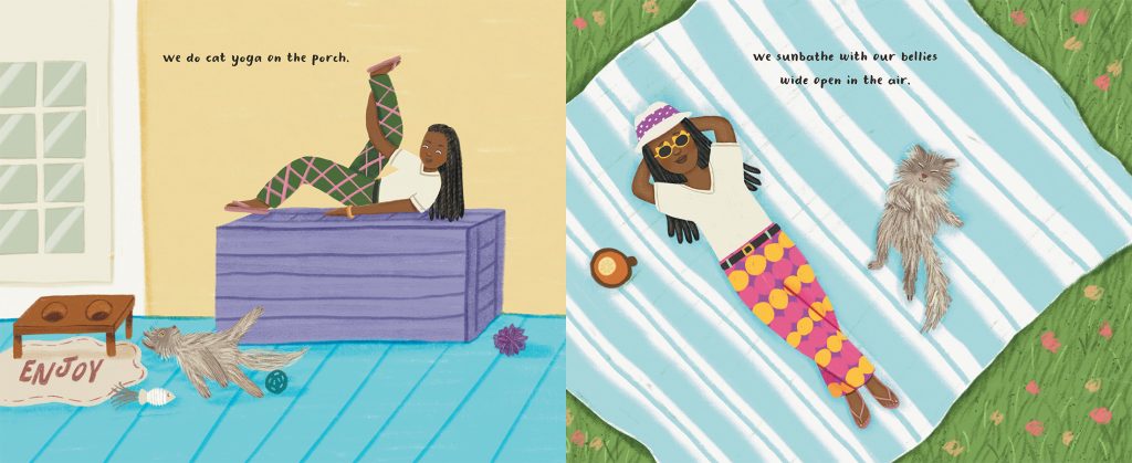
Absolutely! The thing I love about NOT MY CAT is that it is based on real events that happened between Stacey Patton (AKA Staceypants in the story) and the cat who “wasn’t hers”. This made me feel as though I was putting a new lens on reality with my illustrations as opposed to creating my own world. There’s definitely a greater level of care that goes into projects like this because you want to represent the things that happened both accurately and creatively. The publisher sent me several images of Stacey with her cat, so I took it upon myself to bring some of that to life. The cat yoga scene in the book is based off of a real photo! So fun!

What were your favorite parts about working on NOT MY CAT? Was there anything you found challenging with this project?

I actually enjoyed so much about working on this book! But if I had to narrow it down, I’d say I loved the fact that the main character had locs and crazy pants! I also have locs, so it was a connection point to the author for me. And drawing crazy pants… well, that’s just fun! I was really able to let my creativity shine and come up with different patterns and colors that I could only dream of having on my pants. 

The challenging thing about this project is that… believe it or not, I had never really illustrated a cat before this! It’s one thing drawing a cat, but it’s another thing drawing the same cat in different poses and making sure it’s consistent throughout. Sometimes the body would be too long or wouldn’t be hairy enough in some scenes. So it was basically trial and error for me to figure out what worked best. I actually love these types of challenges, though! You say yes and figure out the details along the way!

You also have another book you illustrated coming out at the end of the year called I’M ALWAYS LOVING YOU (written by Kathy Wolff). Can you tell us more about illustrating this book?

Of course! This book is so personal to me. Once I read the manuscript, it was an immediate yes to illustrate this book. As a mother myself, I could relate to every single word (well almost, because there is a line about coffee in there, and I am definitely not a coffee person at all, haha). For the illustrations, I decided on following three different family units throughout the story. I wanted to be as inclusive as I could because all families are different. The first family is a family of four that consists of a mother, father, son, and daughter. The second family is a single father with his daughter, and the third family is a grandmother with her grandson. I cycle through each of these families throughout the pages to show how love expresses itself in different ways. Some of the scenes have a bit of humor that I believe many parents/caregivers can relate to while other scenes are very sweet. I poured my heart out onto those pages!

How would you compare illustrating your first book to your second book? How were the experiences different or similar?

I loved both experiences, but they were very different! For NOT MY CAT, since it was based on a true story about the author, there were certain qualities about the main character, the cat, and the surrounding environment that I needed to make sure I incorporated into the art. So I had a little bit of art direction with that one, but it wasn’t so much that it was overbearing. I was still able to pour myself into the art like I usually do. I really enjoyed it!

For I’M ALWAYS LOVING YOU, it was more of a free for all! I was able to simply read the manuscript and illustrate whatever I wanted to. That felt like a lot of freedom compared to my first book and allowed me to incorporate even more qualities from my life into the story. For example, one of the family units shown in the book… is a direct reflection of my own family! I was very intentional about every little detail and finding ways to tell a separate story from the manuscript itself.

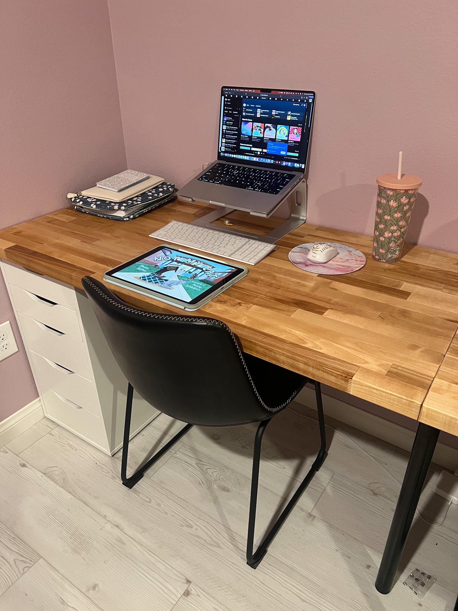
A wooden desk with an iPad and MacBook on top with a black chair and some white filing drawers below.

We’d love to know more about how you work and make your art. Can you share more about your creative process and tools?

All of my illustrations are created digitally using an app on my iPad Pro called Procreate. It’s a powerhouse! My favorite thing about it is the ease of working anywhere. If I want to work at my desk, cool! If I want to work on the couch, also cool! It’s convenient because I don’t have to worry about cleaning up any art supplies; I can easily grab my iPad and go! I recently just built my own desk out of butcher block, and I absolutely love it. I’ve fallen asleep way too many times on my bed while “working” on my iPad, so this will be helpful. It’s way easier to focus at my desk!

What is your biggest hope for your work as a children’s book creator?

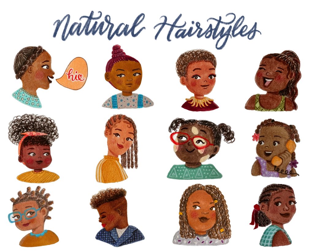
Honestly, my biggest hope for my work is that children will be able to see themselves in my art. I am a firm believer that representation in picture books is so important. I didn’t see enough of myself growing up and I want to ensure that children today have a bunch of options! And as a Black woman, I want to be able to connect to Black girls specifically. That’s also why I love drawing natural hairstyles! I want to remind them that however their hair grows out of their hair is perfect and beautiful! Another one of my dreams is to have my author-illustrator debut! I don’t yet have a polished story for my agent to start querying yet, but I’ve been trying to work toward that.

What is something you’d like to share with other illustrators wanting to break into this industry?

Be yourself! Your art should be a reflection of you and have a unique voice. If you are weird, show that in your art! If you love drawing food or astronauts, make sure those specific things can be found in your portfolio! And don’t include anything you aren’t 100% happy with or anything you don’t enjoy drawing. Always keep working on your craft and asking the right people for feedback! Be okay with making mistakes and creating art you aren’t proud of. It’s all a part of the process, and sometimes you have to crawl through the mud to find some gold.

Learn More About illustrator and author Acamy Schleikorn

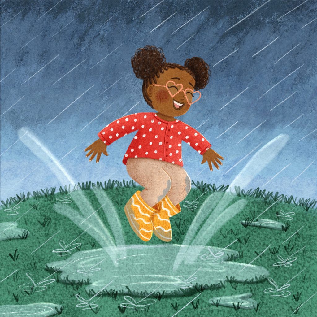
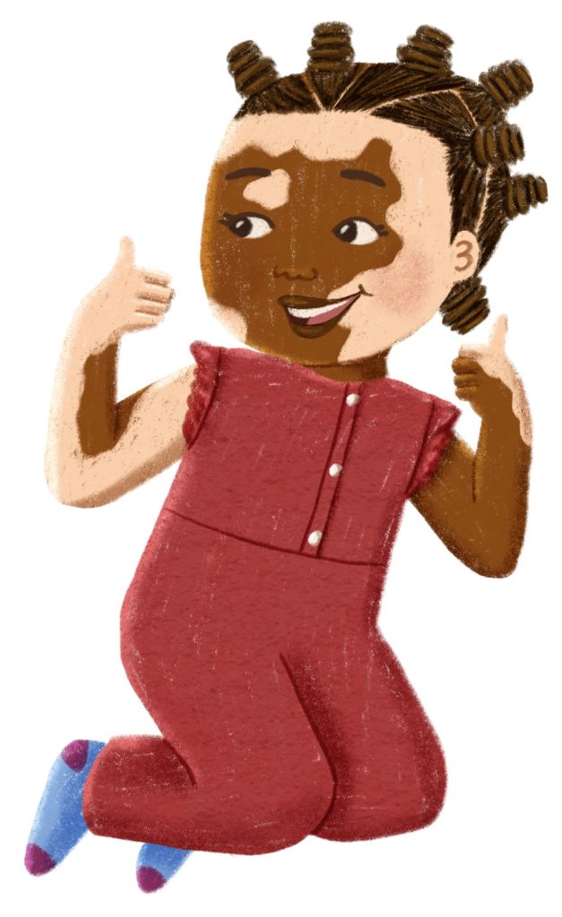
An illustration of a young Black girl with vitiligo and her hair in bantu knots, wearing a red jumper. Art by Acamy Schleikorn.

To learn more about Acamy,  see more of her work, and follow her on social media, check out these links:

Acamy is represented for children’s books by Claire Morance at Painted Words.


Are you a published or soon-to-be published illustrator or author/illustrator who loves creating books about nature, animals, the environment, social justice, or mindfulness? I’d love to chat with you for a KidLit Connection interview! Send me a message.

Primavera Mother—Time-Lapse Painting Demo Video

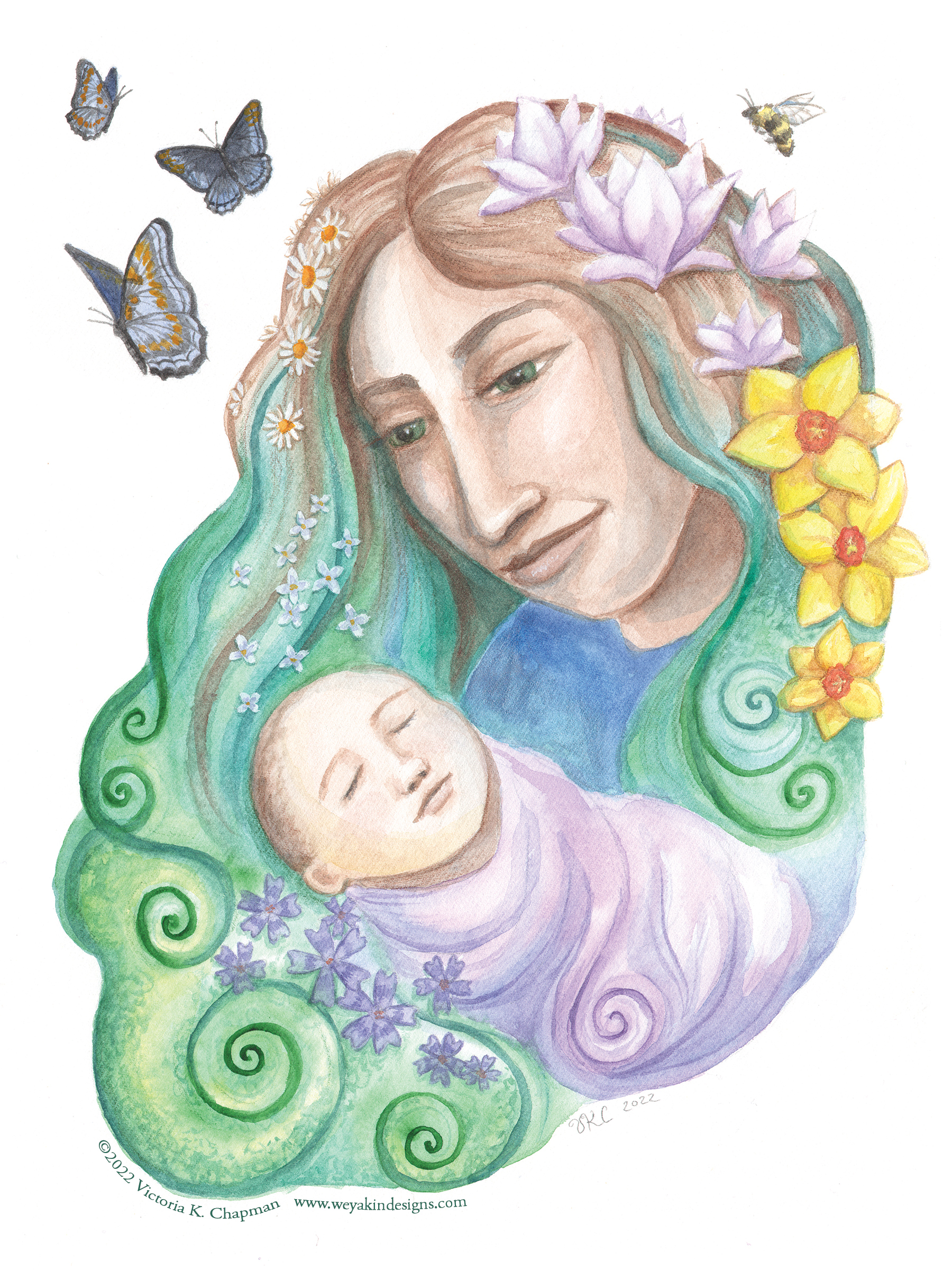
A watercolor mixed-media illustration of a young mother gazing lovingly at her newborn baby. Her hair is filled with flowers and butterflies and a bumblebee hover around them. Art by Victoria K. Chapman.
Primavera Mother by Victoria K. Chapman

I was recently inspired by Mother’s Day, which just passed, and my experience as a mother myself to create a new painting. I was also inspired by the beautiful flowers that are now emerging in the spring. One morning, I visited our local New England Botanic Gardens at Tower Hill in Boylston, MA. I found so much joy in all of the amazing flowers and pollinators sipping up their nectar. I created a sketch from these two sources of inspirations while I was there. The next two days after, I created this new hand-painted illustration, “Primavera Mother” and then made this time-lapse painting demo video to share.
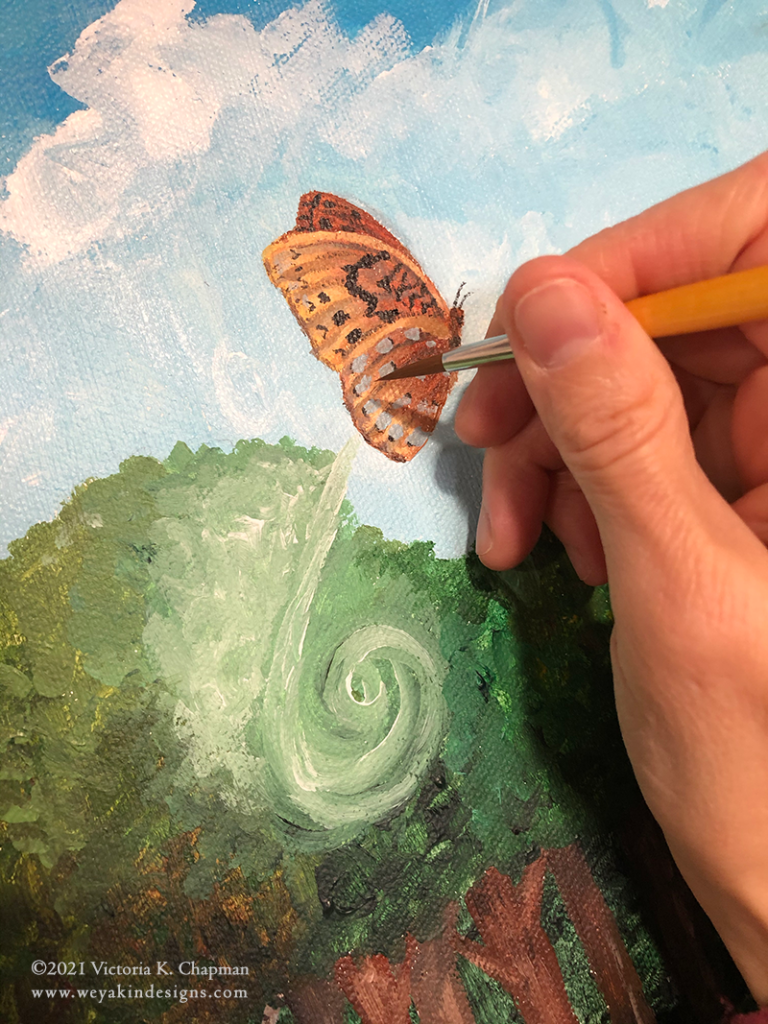
I set up a camera to run while I worked in order to create a time-lapsed video of the illustration process. I always find it so interesting to watch other artists and illustrators paint, draw, and work their craft. I know others enjoy this too. I hope you also enjoy this new video of the process to create “Primavera Mother”.


“Primavera Mother” was created using watercolors, gouache, gel pen, and colored pencils. It took approximately 15 hours to create from drawing sketches to finished painting. There were several hours of video footage to edit down and compress into 4 minutes, which was quite the challenge!

The music in the video is a song I wrote called “Love at First Sight”, which was originally written as a lullaby for my son when he was one year old. The lyrics are about how one loves their newborn baby so deeply and quickly even though they just met. It is the true “love at first sight”. You can hear more of my music at aquaence.com and aquaence.bandcamp.com/music.

If you’re interested in purchasing prints of “Primavera Mother”, you can find both 9×12″ matted prints and 5×7″ matted prints in my online art shop. If you’re interested in purchasing the original, please contact me.

Thanks for watching!


The World Needs Your Light

Recently, I was in a monthly meeting with a solopreneur career coaching group I’m in with Val Nelson. Val is an amazing coach who helps introverts and heart-centered people find their way as business owners or in new careers. Our conversations are not only about business, but also about matters of the heart and mind. In our August meeting, during our grounding meditation, I heard my own inner voice speak to me through my feelings of despair over the state of the world. It said, “The world needs your light”. In fact, the world needs all of our light.

Here I was feeling like the horse Artax in The Never-ending Story, and my own voice was Atreyu saying, “you’re letting the sadness of the swamps get to you”! But, in this version, I did not sink into the swamps of sadness. That inner voice told me to shine my light. That we all need to shine our light, now more than ever. Because when the world feels its darkest, the way out is through becoming a beacon of light and hope for yourself and others. I was inspired to create this new piece from the uplifting conversation with my group members that followed.

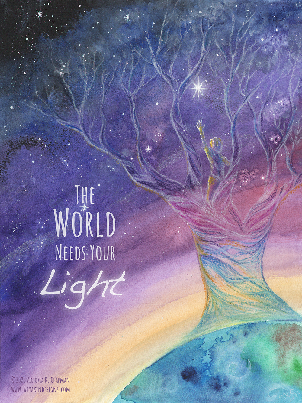
"The World Needs Your Light" original mixed media illustration by Victoria K. Chapman. A whimsical night sky shines with stars over the earth as a large ghostly tree reaches to the sky. In the tree is a child reaching up to the brightest star.

I’ve been wanting to create a sped-up video to show the creation of an entire art piece. This felt like a great time to try that out. This mixed-media illustration titled, The World Needs Your Light was created using watercolors, gauche, India ink, chalk pastel pencils, and iridescent medium, with digital finishing touches. The video shows the process of creating the traditional portions and is sped up 1700%. If only I actually worked this fast! The music playing over the video is an original song I wrote and recorded under my music project Aqueance titled, “Stay Tonight”. 

I hope you enjoy and keep shining your light!


Creating a Growing Family Tree

Working with a local childcare center to create a painting of thanks.

In early March, 2020, Growing Room Child Development Center of Berlin, MA had to temporarily shut its doors for an unknown amount of time due to the COVID-19 pandemic as schools everywhere were forced to do. They were wondering how they would manage to keep their doors open, support their teachers and staff, and when they might ever open again. Through this time, some families stayed on board paying partial tuition to help keep the school from closing its door permanently. Early this year in 2021, they chose to honor those families by commissioning a painting to thank them for their support through the crisis.

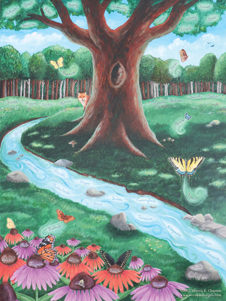
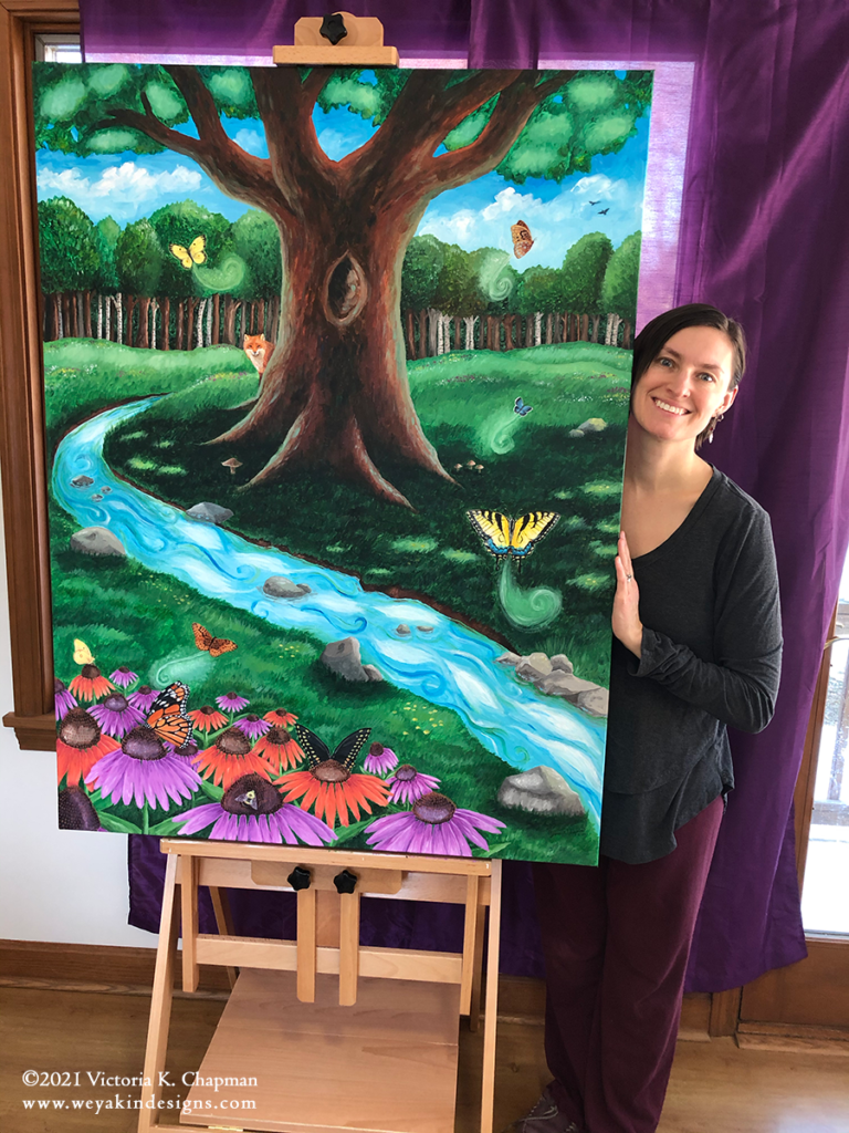
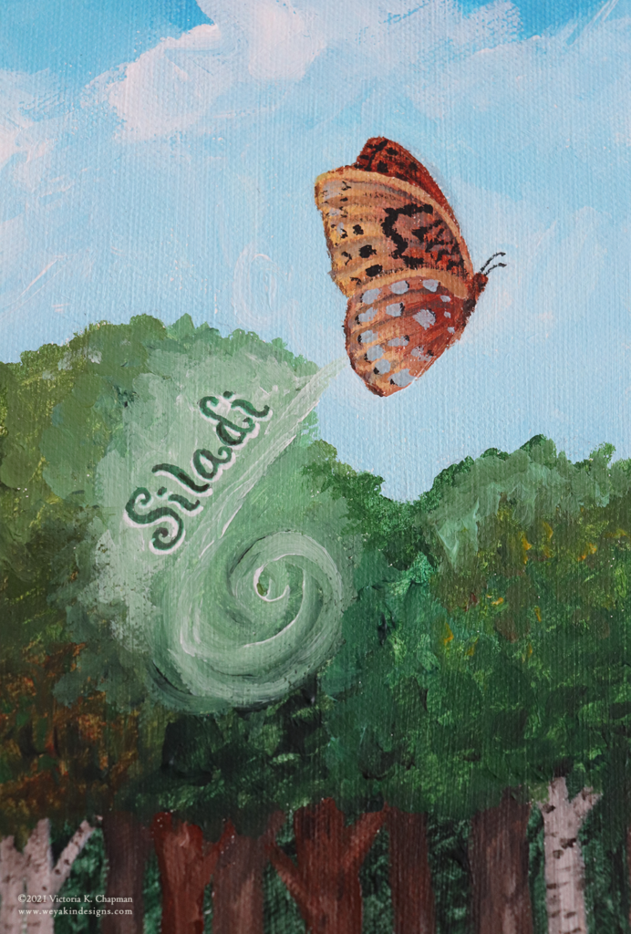
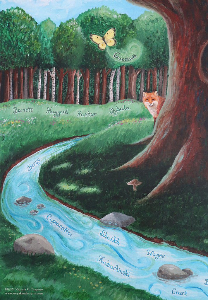
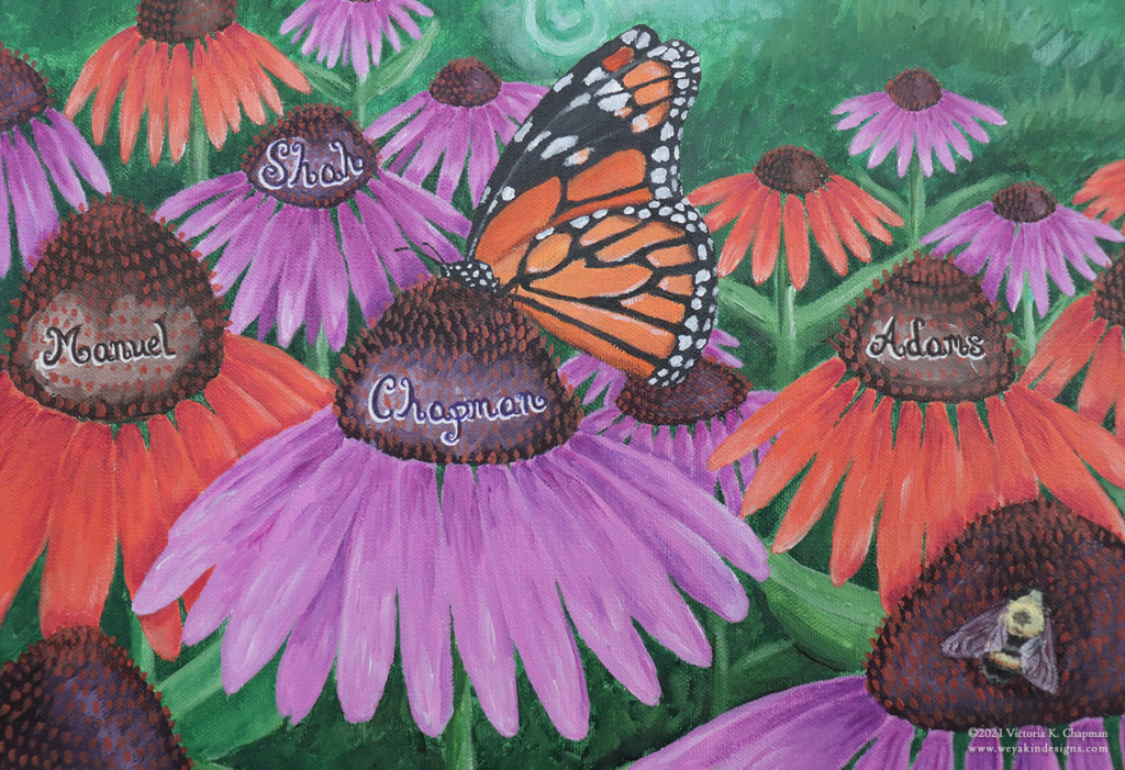
"A Growing Family Tree", acrylic mixed media painting by Victoria K. Chapman. A tree, butterflies, and cone flowers in a field with a stream.

I feel so lucky that I had the opportunity to create this painting for this wonderful local learning center. When they mentioned a tree, butterflies, and flowers, it was almost an instant “yes”! Growing Room reached out to me because we have been one of the families to have a child as part of their school. They were excited to hire one of their parents to be the artist for the special piece for their parent room.

The key pieces to this painting were:

  • a large tree to be a center piece
  • colorful butterflies and flowers
  • large enough to take up a good amount of space on a wall, but not a mural
  • and it should include the 45 names of families who supported them

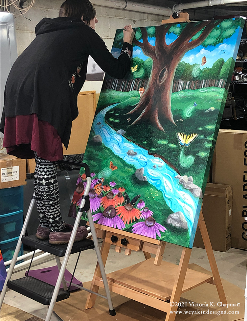
The painting ended up being 36”x48”, which is much larger than I typically work. Because of this, I chose to stray from my typical watercolor mixed media and go with something more suited to large canvases. I chose acrylic paint as the main medium, but used various pens to assist in small details and to add the names. Pens give a smoother look for typography, especially at smaller sizes.

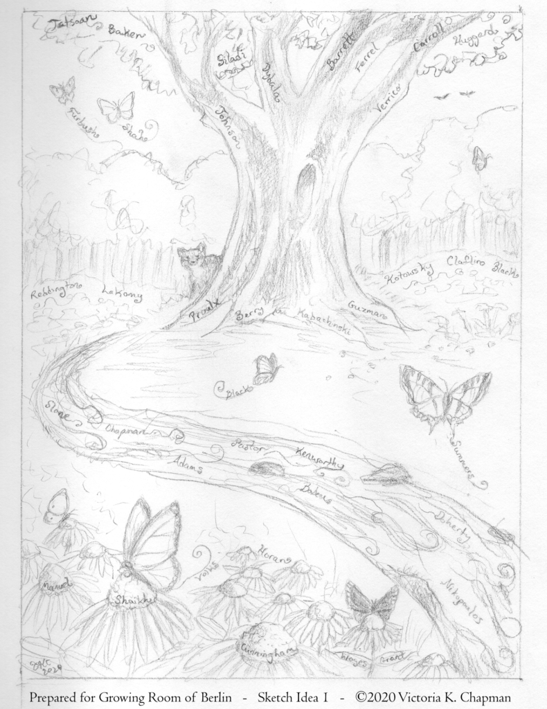
The initial first steps included brainstorming ideas and then sharing of sketches. I presented my friends at Growing Room with three initial sketches, all similar in concept but with some key differences. They ultimately chose sketch #1, which featured a flowing stream and a fox peaking out from behind the tree. I love this phase of the process because I get to explore ideas and come up with creative solutions. The creative thinking piece of art is one of the parts that I enjoy most.

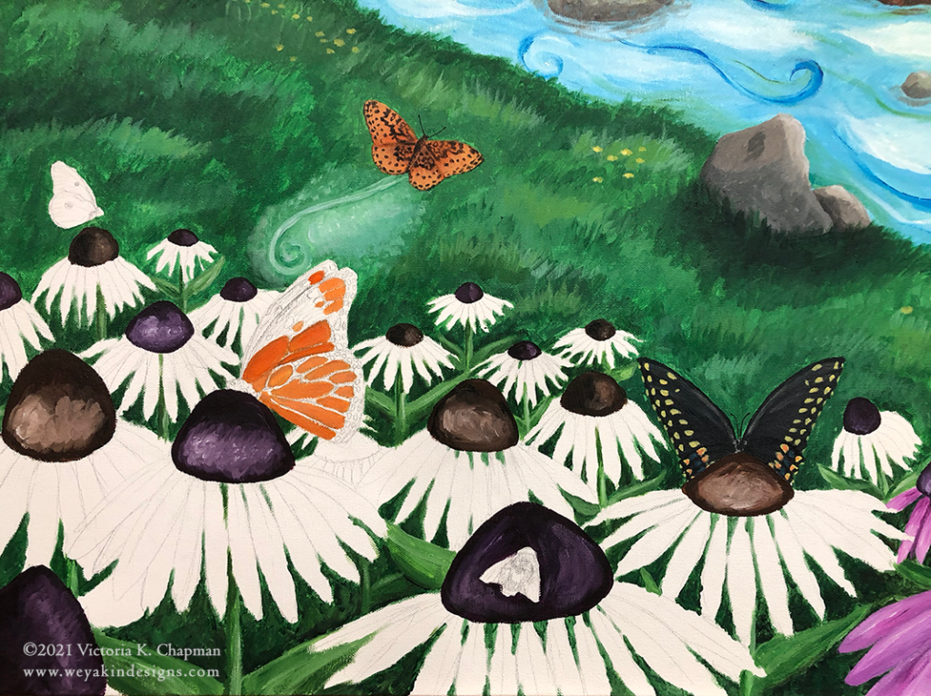
I also took some time to research local and native butterflies and flowers. I chose six species of butterflies native to New England to feature in the painting: monarch, black swallowtail, tiger swallowtail, meadow fritillary, clouded sulfur, and the eastern tailed blue. For the flowers, I chose a native pollinator favorite—cone flowers. Also known as echinacea, the cone flowers come in both purple and orange varieties. To continue the celebration of native pollinators, I added one more pollinator friend—the common bumblebee.

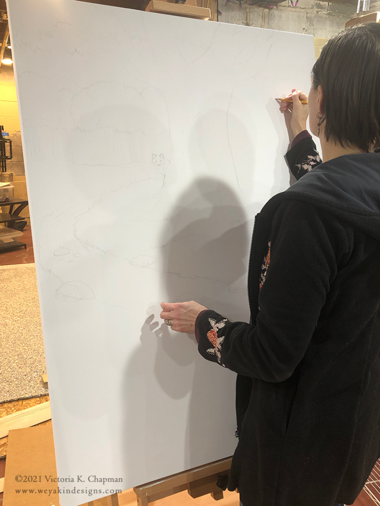
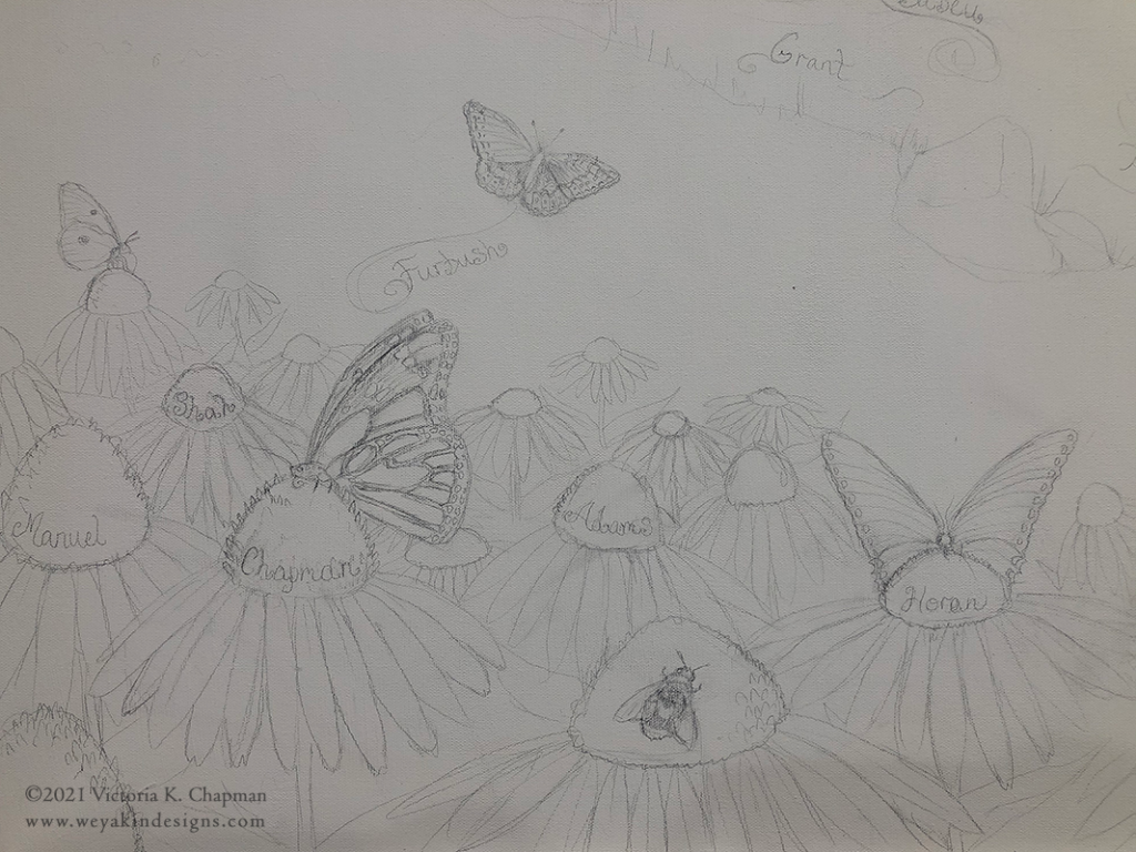
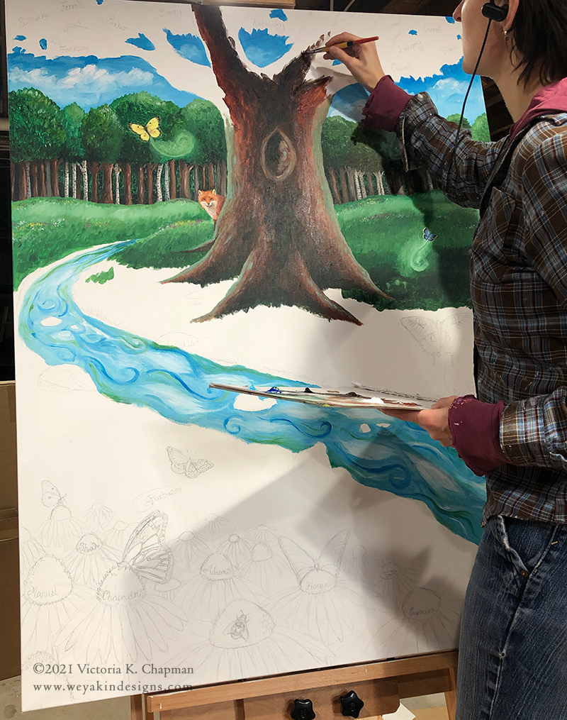
Once the sketch was approved, I moved forward with the final work on canvas. After prepping the canvas and adding white gesso as a base layer, I started by creating pencil outlines on the canvas to block out where all of the elements would be. Going from a 6”x9” drawing to a 36”x48” drawing can be challenging and I wanted to make sure everything was proportional and flowed together on the larger surface. I also penciled in all the family names so I knew I had a spot for each of them that worked with the length of the name. Once the outlines were complete, I took photos to use a reference for when I’d have to add the names back in with pen over the final painting. The names would disappear beneath the paint and I didn’t want to forget where they would be placed.

When I started the paint, I worked from back to front. This means I started with the elements that would be perceived as being in the background and added the foreground elements later. With this in mind, I started first with the sky and the tree line in the back. I found this way of working worked best for acrylics, since they are opaque and can easily be painted over. I layered the finer details over the background colors. The nice thing about acrylics is that they dry relatively quickly. My technique is quite different when I use watercolors, which are transparent.

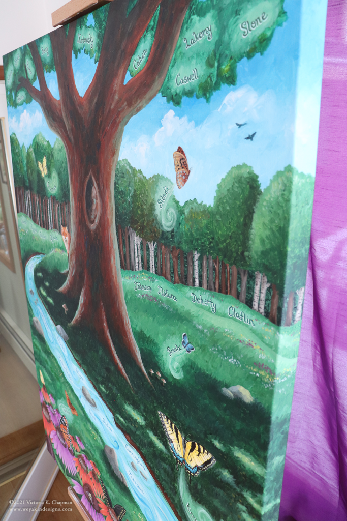
The canvas I was working on had a gallery style profile, which means the thickness of the canvas off the wall is 1.5”. Because the piece wasn’t going to be framed, I made sure to paint all four of the canvas sides as well. Continuing the scenery around the sides, top, and bottom posed another interesting challenge that I don’t have to contend with when working in watercolors.

After I built up all the paint layers and completed the picture, it was time to add the names back in. I used a pencil to sketch in the names to make sure the lettering was even. Then, when all of the names were placed, the marker was added. I used fine tipped permanent felt markers in different colors to go with the piece of the background the name was on. If the names were in the grass or leaves, I used a dark green marker. If the names were in the water, I used a dark blue marker. To bring the names out just a little more from their backgrounds, I finished them off with a white gel pen to create a highlight around the lettering edges.

Once the names were placed and dry, I added some final touches. To bring a little bit more magic into the piece, I added iridescent medium to the water to give it a hint of shimmer. And to protect the whole piece, I coated the entire canvas in a layer of Gamvar matte varnish. Once completely dry, the hooks and hanging wire were added to the back and the entire piece was wrapped up in cardboard for safe delivery.

It was so exciting to deliver the final piece and unveil it in front of the staff who were there. The excitement and joy on everyone’s faces made the experience completely worth it. I hope this painting continues to bring joy to all of the staff, children, and families at Growing Room. It was an honor to create something beautiful that celebrates families and the joy of nature. I’m so excited to share this with a caring part of the community and I hope for similar opportunities to celebrate art and nature in the future.